Author Archives: social

How To: Refresh Your Space for Spring

Inspired Greetings!

At long last, the arctic winds have started to subside and the sun has begun to linger in the sky. Soon the tulips will begin to peak through what was just frozen ground. As Spring approaches, I am thrilled to share tips and trends for refreshing your space. In this week’s blog, we will look at how using bright colors in your home can have a significant impact on your mood and emotions. Get ready to embrace one of my favorite seasons with new room inspirations and exciting products that my team and I have curated just for you!

Blessings, Christa O’Leary

How To: Refresh Your Space for Spring

One of the tools in my “Home in Harmony Toolbox” is the ability to assess a home or office through the lens of psychology. As your natural environment changes from winter to spring, your mind and body begin to feel this shift. It is beneficial to attune your space to be aligned with the natural world.

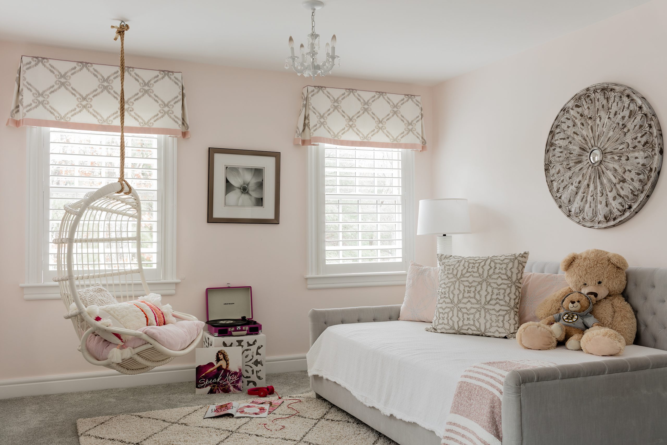
Using bright colors in your home can have a significant impact on your mood and emotions. Bright colors can create a sense of energy and excitement in a room, making it feel more lively and vibrant. Colors can also evoke feelings of happiness and positivity, which can improve mood and well-being. Blue sky, green grass and pink tulips can create a cascade of happy hormones in your body that impact your level of contentment. Using those colors in your home can have a similar effect.

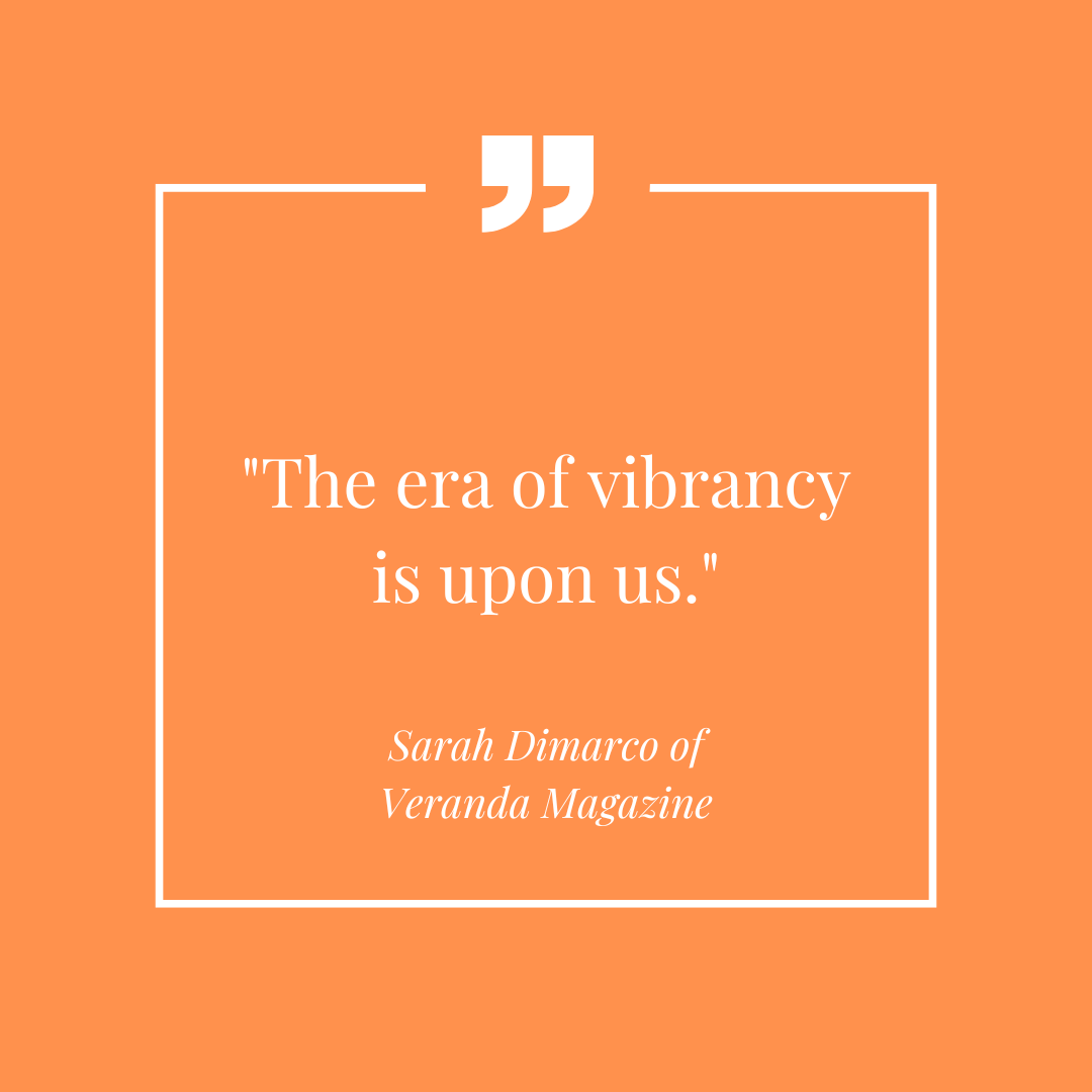
You might be wondering what the color trends are for spring 2023. Sarah Dimarco of Veranda Magazine explains that “The era of vibrancy is upon us.” Some of the popular colors this year include the many shades of green as well as the bright and bold hues of oranges and magenta.

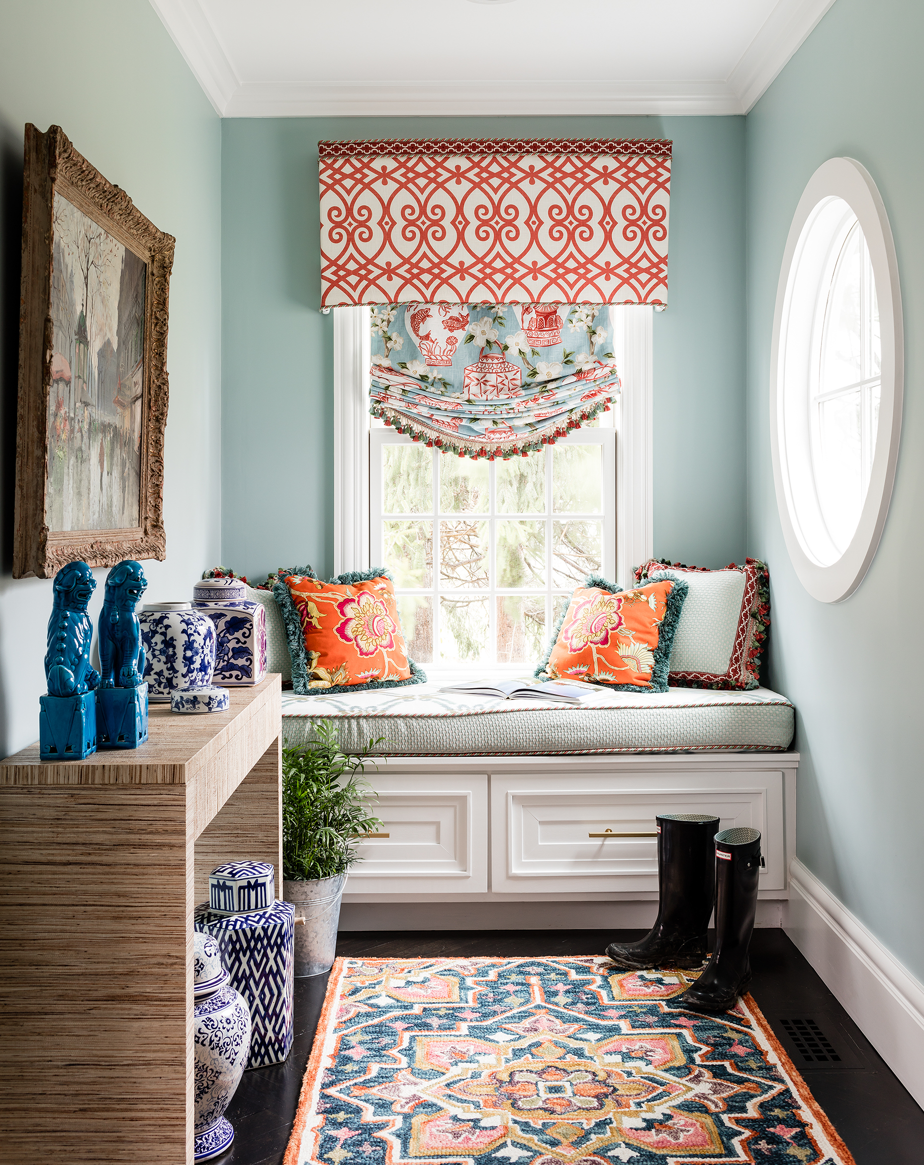
When selecting bright colors, consider the psychological association of each hue. For example, red can be energizing and passionate, while yellow can be cheerful and optimistic. Decide what you want to feel in your space and how it will best serve you and your circumstances. Do you need more intensity or do you need more joy in your life? Assessing where you are and where you want to be will help you determine what colors are best to incorporate in your space.

Remember, ultimately the colors you choose for your home should reflect your personal style and you feel comfortable and happy in your space.

Simple Solution: If your walls are gray, add a pop of your favorite color to liven up the space with accent side tables or bold lamps in your favorite hue.

The Color of Calm

Inspired greetings,

It has been a while since I’ve been in touch. I’m so happy to be reconnecting with you! I hope the last three years have been filled with peace in your home, despite the turbulent world. I wanted to take the time to update you on my journey and provide you with some great content to help you create your home in harmony. Thank you for being a part of my community and I look forward to creating solutions for you to design inspired living!

For 23 years I have been helping people create home and office environments that are both aesthetically beautiful and psychologically nurturing. I have taken courses in anything related to our homes from Feng Shui & clutter clearing to green design & color psychology. I often refer to these certifications as “tools-in-my-tool-box” that help me assess an interior environment and create a design that nurtures the mind, body and spirit of those that live or work within the walls. In todays blog, I am going to focus on design and color psychology.

Design psychology is the study of how people interact with design elements in their environment. It focuses on understanding how visual elements, colors, shapes, and materials affect people’s behavior and emotions. Design psychology helps me look at how people interpret visual stimuli, room & furniture layouts and how they respond to different colors. It also examines the influence of culture, context, and personal preferences on design. Design psychology helps me create spaces that are both aesthetically pleasing and emotionally satisfying. By understanding the psychological effects of design, I can purposefully create experiences that support the people that live or work in the environment and make them feel connected to their space. 

During this time of year we see an abundance of pink. Let’s look at the color pink through a design & color psychology lens. Pink is a color that is often associated with femininity, love, and romance. It is also associated with being innocent, sweet, and caring. In color psychology, pink is said to have a calming and soothing effect. It can be used to help relax and unwind, and it can help to create a sense of peace and harmony. Pink can also help to reduce aggression and negative emotions, making it a great choice for those trying to create a calming or peaceful atmosphere. Pink can also be used to help promote creativity and foster a sense of unity and togetherness. For pink room inspirations check out @HomeinHarmonyDesigns! We are dedicating the month to pink inspo!

Simple Solution: If you like the idea of creating calm in the midst of a chaotic world, use pink in your home to foster a soothing psychological response. An easy way to do this is by incorporating accent pieces like pillows, rugs, and artwork. Play around with different shades, textures, and patterns to create an inviting and unique space.

Design psychology is a tool-in-my-toolbox that allows me to see and assess spaces. This lens enables me to create home environment that nurture and support the individuals or families that live there. 

Please join me on Instagram @HomeinHarmonyDesigns to see our latest projects, products and events! This is a great way to connect, be part of the conversation and enjoy the community! I really hope to see you there.