 I LOVE playing with color! Thankfully when I am designing spaces I am able to use color to create the feel, mood and atmosphere that will touch the mind, body and soul of those entering the space. I look around our world and am so thankful for the colors and textures that we are able to look at through the lens of life. What makes me even more excited about color is understanding that color is not only fun to look at but that it affects us both psychologically and physiologically! Yes, that’s right, it actually has an impact on your mood and biology. It can make you hungry, angry or harmonious. It really is important to be mindful of what colors you are including in your life and begin to understand how they impact you. In this weeks article we will take a deeper look into the spectrum of color, how to choose the best color and the ways it can help you create home, health and happiness!
I also want to take a moment to acknowledge and welcome the thousands of new members of the Home in Harmony Community! We are really excited you are here! I also want to say thank you to the members of our community that have been with us for a while. Your continued support and encouragement allows us to enthusiastically grow and expand. Please let my team and I know how we, at Home in Harmony Headquarters, can support you best! I hope the information we provide you enables you to find inspiration in designing inspired living and creating home, health and happiness! I also want to share that we have some exciting things on the horizon based on feedback we received from the super successful Home in Harmony Master Class! So, keep on the lookout! Also, we would love for you to hop on over to Facebook or Twitter and join the conversation!
I have had many conversations around the topic of color. Recently, we were finishing up a corporate design project for a law firm in Connecticut and everyone who came through the door would mention how they loved the chosen colors from the cool grays to the soothing ocean hues. At a staging project in Boston we discussed which colors to incorporate to make the environment feel inviting and a place one would want to stay. I choose colors based on the needs of the inhabitants, how it will work with the lighting of the space and how it coordinates with the colors that are already there. Let’s look at how to choose colors that will help you design an inspired home and life!
Psychology & Physiology Needs
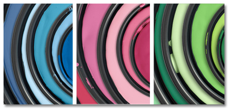
Studies have shown that color affects our physiology and psychology. For instance, blue is scientifically proven to produce a cooling effect on the body (physiology) and a calming effect on the mind (psychology). It is also known to diminish hunger. Red, on the other hand, is considered a power color associated with authority, aggression and prestige (think about the red carpet or the power tie). Red accelerates your heart rate and increases feelings of hunger and aggression. When designing a space it is important to take into consideration what type of space would benefit you the most and what you hope to achieve in the space. If you are feeling agitated and anxious you might benefit from calming or cooling tones. If you are depressed or lethargic a splash of vibrant color might be just what you need. First assess where you are and what you need. Next, determine what type of space will support you the most. Once you have evaluated these two things you will be in a position to choose colors that help your home, health and happiness.
Lighting
Have you ever noticed that a paint color looks much different in the paint store under fluorescent lighting in comparison to when you get it home? Or, have you ever loved a color in a magazine and put it on your own wall to find out it doesn’t look the same? This is because color is impacted by light. The color will look different under overhead lighting, lamp lighting and northern or southern natural light exposure. Natural light will give you the ‘truest’ sense of the color because it has a neutral balance of the warm and cool ends of the light spectrum; the warmer end of the spectrum being yellow and the cool end being blue. Interestingly colors that are most impacted by light are the grays, taupes, blues, greens, lavenders and mauves. I once painted a Show House room in one of my favorite colors, Benjamin Moore’s Wedgewood Gray, and when people entered the space they often thought that each wall was painted in a unique color. However, all the walls were Wedgewood Gray. It was just how the light played with the undertones making it look green hued on one wall, tinged blue on another and cement gray on yet another. When choosing a color for your home, I recommend painting a large sample board with the color and watch how the light influences it during the day & night and with the lights on & off. This will help you determine if you love the color in all its complexity!
Compliment & Coordinate
An entire home can feel out of balance because there isn’t a graceful flow of colors. It is important to notice all of the colors you are utilizing in a space to make sure it is congruent. This will help you feel balanced and harmonious. Your surroundings can bring a sense of grounding, ease and grace into your life when the colors coordinate and compliment one another. Competing palettes create dis-ease, restlessness and agitation. Choose colors that support you and carry those colors throughout your space. If your kitchen is blue, be sure to incorporate blue tones throughout your home to make it feel consistently congruent. This will give a sense of balance and harmony to your space. When your space feels harmonious it nurtures your mind, body and spirit allowing you to be the best you can be.
Choosing colors can be a tricky process. The good news is that when you break the process down it diminishes overwhelm and anxiety. Color selection should be a fun and fascinating process. It allows you to look at your life through a lens that sees the spectrum of colorful possibilities in designing your inspired life.
If you would like guidance to begin living your Inspired Life feel free to connect with me for a FREE 20 Minute Home in Harmony Lifestyle Private Call by clicking here!
Happy Soaring!
XOXO
![]()
Along with paint color and light, remember to consider your wall decor, furniture, and carpet or other flooring design and color.